
Reading options
What's inside (8 sections)
Why I Finally Sat Down With This Big Familiar Brick
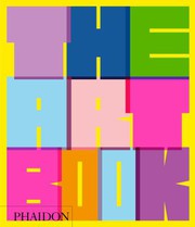
I have walked past this book for years in stores and libraries. You know the one. Big, thick, glossy, with a different artwork on the cover depending on the edition. I finally decided to spend real time with the Phaidon Press 2020 revised edition, the one that runs 592 pages and carries ISBN 9781838661342. It is a standalone reference, not part of a series, though Phaidon has companion titles. The first version came out in 1994, and this version updates and expands that idea for a new generation.
My personal opening take is this. I expected a coffee table trophy. Something to flip through and say nice colors. What I found is more like a patient teacher. Each artist gets one page, one key work reproduced large, a short entry that tells you what to look at and why it matters, plus small boxes with birth and death dates, nationality, movement, and cross references. You can read it A to Z or open at random. I did both. I read straight for a while, then jumped when a name caught my eye.
The physical facts matter here. At 592 pages, it is heavy but not impossible to hold on a couch. The paper is thick enough that colors stay true. The type is small but readable. The layout is consistent, which sounds boring until you try to use it for study. Consistency lets you compare a 15th century altarpiece with a 2020 installation without getting lost in design tricks. I kept a finger in the glossary and another in the index because I kept wanting to chase connections.
A fair criticism up front. One page per artist is both the genius and the limit. You get a clear first taste, never a full meal. If you already love an artist, you will want more. If you hate the chosen example, you might misjudge them. But as a doorway, it works. I found at least twenty artists I had never heard of and now want to follow, which is exactly what a reference like this should do.
Open to any page and you meet someone who spent years learning how to see.
How the A to Z Actually Works on the Page
Let me explain the structure because it is the whole trick. The book is arranged alphabetically by artist surname, from A to Z. Each spread or page follows the same rhythm. On one side you get a full color reproduction of a signature work. On the facing page you get the name, dates, a few hundred words of explanation, and key details. There are also small thumbnail cross references that say if you like this, look at that artist on another page.
I tested it like a student would. I looked up names I knew. Leonardo, Rembrandt, Hokusai, Frida Kahlo, Andy Warhol. Each entry picks one work to stand for a whole career, which is a bold choice. For Leonardo they do not try to show everything. They pick and explain. For Warhol they pick an image that shows repetition and celebrity and flat color in one glance. The text does not waste time on gossip. It says what the artist did new, how they made it, what to notice in this specific picture, and where they sit in history.
Then I looked up names I half knew. Artemisia Gentileschi, El Anatsui, Yayoi Kusama, Kerry James Marshall. This is where the book earns its space. The entries are plain spoken. They explain Gentileschi's command of drama and light without turning her into only a biography of suffering. They explain Anatsui's bottle cap hangings in terms of material, labor, and shine, so you understand why a photo does not do it justice. They explain Kusama's dots as pattern, repetition, and infinity, not just selfie background.
The alphabetical order creates funny neighbors. A Renaissance master can sit near a contemporary photographer. At first that feels random. After a while it feels freeing. You stop expecting a timeline and start seeing rhymes. A pose in a Baroque painting echoes in a modern portrait. A color problem solved in 1600 gets solved again in 1960 with plastic paint. The book does not lecture about this. It lets proximity do the work, then gives you page numbers to follow the thread.
If I am being critical, the sameness can blur after fifty pages straight. Your eyes get tired. The fix is to read in chunks. Twenty pages, walk around, look out a window, come back. It is a reference, not a novel, and it rewards grazing.
From Cave Walls to Phones, What Counts as Art Here
The range is the selling point, and the 2020 revision makes a point of widening it. You get painting, sculpture, printmaking, photography, video, performance documentation, installation, textiles, ceramics. You get Europe and North America, but also much stronger presence for Africa, Asia, Latin America, the Middle East, and Indigenous makers than the 1994 first edition had. It is still not perfect. No single volume could be. But the direction is clear. More women, more artists of color, more work made outside the old centers.
I liked tracking materials across time. One page shows egg tempera on wood, careful and flat and glowing. A few pages later you get oil paint built up in layers you can almost feel. Then acrylic, spray paint, neon, found objects, embroidery thread, clay, bronze, steel, light bulbs, video stills. The entries are good at naming the stuff without getting technical for its own sake. They tell you why the material matters. Why bronze lets a figure stand outdoors for a century. Why cheap printmaking let an idea travel fast. Why a quilt can carry history that a monument leaves out.
There is also a quiet argument here about what counts. A fashion designer who changed how bodies look, a potter who changed how a tea bowl feels in the hand, a photographer who changed how a protest is remembered. The book treats all of them as serious makers. It does not rank painting above craft. It asks a simpler question. Did this person change what other makers thought was possible. If yes, they get a page.
My criticism is that performance and conceptual work are hardest to show in one still image. A photo of a performance is not the performance. The text admits this by describing what happened, how long it lasted, who was there. But you still feel the gap. I found myself going online to watch clips after reading those entries, which is fine. The book sparked the search. It just cannot finish it on paper.
One more personal note. I started keeping a list of works I want to see in person. Not prints. Real scale, real surface. The book is honest that size matters. A tiny devotional panel and a wall sized abstraction do different things to your body. The captions give dimensions, and after a while I started checking them first.
Learning to Look, One Entry at a Time
The writing style is worth describing because it shapes how you learn. Entries are short, usually around 200 to 300 words. No footnotes. No jargon without explanation. Each one answers three quiet questions. What am I looking at. How was it made. Why did it matter then and now. The tone is calm and direct, like a good museum label that actually respects you.
Take a typical entry rhythm. First sentence places the artist in time and place. Next sentences describe the image on the page. Notice the hand in the corner, the shadow that does not match the light, the repeated face, the frayed edge. Then a sentence or two of context. Who taught them, who they argued with, what problem they were solving. Then a closing line that points outward. See also this artist, or compare with that movement. I found myself reading the picture first, then the text, then the picture again. The second look is always better.
The book also teaches terms without a classroom feel. Words like chiaroscuro, collage, readymade appear when needed and are explained in plain language. The glossary at the back helps, but most entries define by example. You learn perspective by seeing a floor tile snap back in space. You learn abstraction by seeing a landscape reduced to bands of color until you cannot find the horizon. It is learning by looking, which suits visual people and impatient readers alike.
A small gripe. Because entries are so short, they sometimes smooth over arguments. An artist whose meaning is debated gets one clean reading. That is understandable for space, but I wished for an occasional phrase like some see it differently. Still, for a general reader, clarity beats hedging. You can chase debates later. First you need a foothold.
Look longer than you think you need to, then read, then look again.
I wrote that in my notebook after about a hundred pages. It sounds simple. It changed how I used the book.
Who Is Missing and Why That Conversation Matters
Any book that claims to gather key artists in one volume will face the who is missing question, and this one does. With around 600 artists featured across 592 pages, choices are tight. Some readers will miss their favorite painter. Some will question why a famous name gets the same single page as someone just emerging. Some will note whole traditions, like calligraphy or textiles from certain regions, get fewer pages than European oil painting.
The 2020 revision clearly listened to earlier criticism. It added many contemporary figures, more photography, more work that deals with identity, migration, and politics. It kept the old masters because you cannot understand later breaks without them, but it trimmed some lesser known academic names to make room. I compared my memory of the older edition with this one and felt the balance shift. The book feels less like a greatest hits of museums I already know and more like a map of studios I should visit.
Still, fair criticism stands. One page cannot fix centuries of uneven recording. Women artists before 1900 remain fewer because fewer were allowed training, commissions, and preservation. Artists working in perishable materials or outside markets left less to photograph. The editors acknowledge limits in the introduction without making excuses, which I respected. They present this as a starting point, not a final ranking.
What helped me was using the index and cross references as a corrective. If an entry felt lonely, I followed its see also links. Often I found a cluster. A sculptor led to two assemblage artists led to a photographer who documented their street. Suddenly a single page became five. I also supplemented with local museum sites for deeper context on artists from my own city. The book invites that. It does not pretend to be the only source.
One practical tip. If you teach or study, pair this with a timeline on the wall. The A to Z scrambles chronology, which is fun for browsing but confusing for exams. A simple timeline fixes it. Put sticky notes for movements and you will see the gaps and overlaps fast.
How I Actually Used It for a Month
I want to close the tour with use, because reference books live or die by use. I kept The Art Book on my table for a month and reached for it in specific ways. Before a museum visit, I looked up three artists in the show to prime my eyes. After, I looked up two I had ignored in the galleries and felt annoyed at myself for walking past. During a documentary, I paused to check dates and spelling. While helping a teenager with homework, we played a game. Open random, describe the image in thirty seconds, then read the entry to check.
It worked for all of that. The reproductions are good enough to remember in a gallery. The dates are easy to find fast. The language is clean enough to quote in a school paragraph with attribution. The book lies flat enough to copy a pose for a sketch, which we did, badly and happily. It also survived crumbs, pencil marks, and a cat. That matters for a book meant to be handled.
There are limits I should name. Colors shift a little from the real thing, as they always do in print. Very dark paintings lose detail. Very large installations feel small. Sculpture suffers most, since one angle cannot show the back. The entries do warn you when scale or setting matters, but you still need to see work live when you can. Think of the book as a menu, not the meal.
Would I recommend buying it versus borrowing. If you visit museums, teach, make things, or just like flipping through pictures with smart captions, buying makes sense. It is sturdy, it will not date fast, and the 2020 revision will stay useful for years. If you need deep scholarship on one artist, borrow this first to orient, then get a monograph. I am keeping mine. It has pencil stars next to pages I want to revisit, and that feels like the right ending. A reference that turns into a personal list is doing its job.
FAQ
Is this different from the 1994 original?
Yes, the 2020 revision adds many contemporary and global artists and updates images and texts.
Can beginners use it without background?
Yes, entries avoid jargon and teach by close looking at one work at a time.
Similar books
The Letters of Vincent van Gogh
Vincent van Gogh's letters to his brother Theo, in a Penguin Classics selection edited by Ronald de Leeuw, trace a decade of work, faith, and obsession.
2,611-word summary · 12 min read
The Zookeeper's Wife: A War Story
The directors of the Warsaw Zoo hid roughly three hundred Jews in empty cages and outbuildings after the German invasion, while Jan worked for the resistance.
2,065-word summary · 9 min read
The Art Forger
A disgraced Boston painter agrees to copy a Degas stolen from the Gardner Museum, then begins to suspect the original she is copying is itself a forgery.
2,117-word summary · 9 min read
Long Walk to Freedom
Mandela's account of a Thembu childhood, a law practice, a banned movement, twenty-seven years in prison, and the negotiation that ended apartheid.
2,454-word summary · 11 min read
1491: New Revelations of the Americas Before Columbus
Charles C. Mann gathers archaeology, ecology, and demography to argue that the Americas before Columbus were older, fuller, and more deliberately shaped than…
2,712-word summary · 12 min read
The Hunger Games Tribute Guide
The official 2012 companion to the first Hunger Games film profiles all twenty-four tributes and walks through the reaping, training, and interviews.
2,092-word summary · 9 min read
The DaVinci Code: A Quest for Answers
A short 2006 dialogue in which three friends test Dan Brown's claims about Jesus, Mary Magdalene, Nicaea, and the canon.
2,088-word summary · 9 min read
Nothing to Envy
Barbara Demick follows six defectors from Chongjin through the North Korean famine, showing how ordinary people lived, believed, and finally left.
2,068-word summary · 9 min read
The Agony and the Ecstasy
Irving Stone turns Michelangelo's seventy years of carving, painting, and arguing with popes into a novel about the cost of making something that outlives you.
2,260-word summary · 10 min read
Down and Out in Paris and London
Orwell's account of washing dishes in Paris hotels and tramping through London does not ask for pity, only for a clear look at how poverty actually works.
2,282-word summary · 10 min read
The Wright Brothers
David McCullough tells the story of two self-taught Ohio brothers, working largely alone and out of a bicycle shop, who solved the problem of flight before…
2,027-word summary · 9 min read
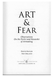
Art & Fear: Observations on the Perils (and Rewards) of Artmaking
Two working photographers write a short, blunt book about why people stop making art, and how to keep going when the work is going badly.
1,994-word summary · 9 min read
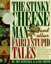
The Stinky Cheese Man and Other Fairly Stupid Tales
Scieszka and Lane Smith take nine fairy tales apart, joke by joke, while Jack, the narrator, keeps losing the pages.
2,206-word summary · 10 min read
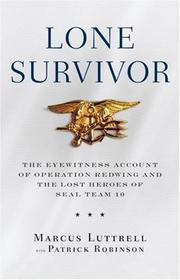
Lone Survivor: The Eyewitness Account of Operation Redwing and the Lost Heroes of SEAL Team 10
Marcus Luttrell's account of the 2005 SEAL mission in Afghanistan that killed three of his team and left him alone.
2,144-word summary · 10 min read
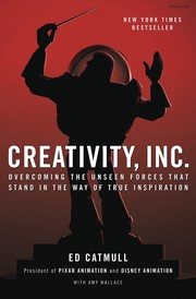
Creativity, Inc.: Overcoming the Unseen Forces That Stand in the Way of True Inspiration
Pixar's president on why the studio that made Toy Story nearly broke itself, and the daily habits that kept the creativity coming.
2,179-word summary · 10 min read
Bury My Heart at Wounded Knee: An Indian History of the American West
Dee Brown's 1970 retelling of the American West from the point of view of the people it destroyed.
2,233-word summary · 10 min read
Big Lies in a Small Town
A 22-year-old woman leaves prison to restore a 1940 mural, and Edenton, North Carolina, starts talking.
2,187-word summary · 10 min read
At Home: A Short History of Private Life
Bill Bryson tours his own Norfolk rectory room by room to explain how private life and the modern home got built.
2,334-word summary · 10 min read
The Birth of Venus
A Florentine merchant's daughter trains as an artist, marries a man who hides a secret, and survives Savonarola's bonfire of the vanities.
2,404-word summary · 11 min read
Prisoners of Geography: Ten Maps That Tell You Everything You Need to Know About Global Politics
Tim Marshall explains how mountains, rivers, coasts, and resources shape the choices of nations, from Russia's flat borders to the chokepoints of the South…
2,328-word summary · 10 min read
Loving Frank
Mamah Borthwick Cheney leaves her family for Frank Lloyd Wright, and their affair becomes a public scandal that ends in tragedy at Taliesin.
2,034-word summary · 9 min read
How to Cook Everything: Simple Recipes for Great Food
Bittman's 1998 doorstop taught a generation that dinner is a technique, not a recipe, with master recipes and variations instead of rigid instructions.
2,027-word summary · 9 min read
The Lost City of Z: A Tale of Deadly Obsession in the Amazon
David Grann retraces Percy Fawcett's 1925 disappearance in the Amazon and finds that the lost city he sought was not entirely a fantasy.
2,493-word summary · 11 min read
The Clockmaker's Daughter
A London archivist finds a Victorian satchel holding a photograph, a sketchbook and a letter, then follows them to Birchwood Manor, where a young woman died in…
2,886-word summary · 13 min read
Letters to a Young Poet
Rilke's ten letters to a young officer cadet refuse easy criticism and ask whether he must write, offering patience and solitude as a way of life.
2,530-word summary · 11 min read
Exodus
Leon Uris's sweeping 1958 novel follows Jewish refugees, Haganah fighters, and Holocaust survivors from Cyprus to the founding of Israel and the 1948 war.
2,529-word summary · 11 min read
The World Is Flat: A Brief History of the Twenty-first Century
Thomas L. Friedman's 2005 bestseller argues that technology, trade, and open borders leveled the global playing field, and it names the ten forces that did it.
2,369-word summary · 11 min read
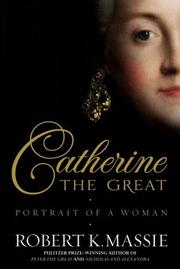
Catherine the Great: Portrait of a Woman
A German princess survives a miserable marriage and a coup to rule Russia for thirty-four years, torn between Enlightenment ideas and absolute power.
2,065-word summary · 9 min read
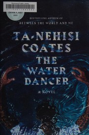
The Water Dancer
An enslaved man with a strange power for travel fights to free himself and rescue those he loves.
2,910-word summary · 13 min read
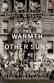
The Warmth of Other Suns
Three migrants ride north out of Jim Crow toward Chicago and LA.
2,561-word summary · 11 min read