
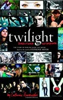
Twilight Director's Notebook
2,863-word summary 13 min read 163 pages in the book
- First published
- 2009
- Publisher
- Little, Brown and Company
- Pages
- 163
- ISBN
- 9780316070522
Reading options
What's inside (9 sections)
- How Hardwicke wanted Forks to feel
- Tapes, nerves, and finding Bella and Edward
- What Bella and Edward wear and why it matters
- Houses, school, and woods that had to feel true
- Baseball in a storm and a fight in a ballet studio
- Music, camera moves, and the cutting room
- What holds up and what feels dated now
- Key takeaways
- FAQ
I found Twilight Director's Notebook in a library sale bin for a dollar, wedged between diet books and an old atlas, and I bought it because I wanted to remember what 2008 felt like. I had seen Twilight in a packed theater where girls screamed every time Robert Pattinson looked at the camera. I had opinions about the blue tint and the fast running and the prom scene. This book, published in 2009 by Little, Brown and Company, 163 pages, written by the film director Catherine Hardwicke, promised to show how that movie got made. It is not a memoir and not quite an art book. It reads like someone opened her work binders and let us flip through, with notes in the margins.
How Hardwicke wanted Forks to feel
The first part of the book lays out Hardwicke's vision, and I liked this section more than I expected. She did not want a slick vampire movie. She wanted wet, green, cold. She talks about growing up with wide skies and then arriving in Oregon to scout, seeing mist stuck in fir trees, moss on everything, light that goes gray by three in the afternoon. She includes location photos with scribbles like keep this fog and no sun here. She wanted Bella Swan's world to feel small and damp and a little lonely before Edward Cullen ever appears.
She also explains her choice to shoot handheld a lot, close on faces, letting actors bump into the frame. She wanted the feeling of being a teenager in a hallway, crowded and watched. She writes about color, how she pushed for desaturated blues and grays for Forks, then warm golds inside the Cullen house to make that home feel separate from the town. There are paint swatches and fabric scraps photographed on the page, which sounds dull but actually helps. You can see the exact gray blue she wanted for Bella's truck and the warm wood tone she wanted for the Cullen kitchen.
Hardwicke is frank that she had little time and less money than people assume for a hit series. She does not give numbers in detail, which is a gap I will come back to, but she keeps mentioning fast decisions, rewriting on weekends, cutting a set piece to pay for another day in the woods. She includes a page of her own to do lists, with items crossed out and arrows everywhere. It makes the vision feel practical rather than lofty. She was not dreaming up Forks from scratch. She was trying to find it on roads outside Portland before the light failed.
What fans learn here is how much of Twilight's look came from need. The overcast skies were free. The real high school was cheaper than building one. The forest was close and thick. Hardwicke turned those limits into mood. When she writes about falling in love with a certain pullout on a logging road because the trees formed a sort of arch, you believe her. You can see why the movie feels grounded even when the story goes wild.
Tapes, nerves, and finding Bella and Edward
The casting section is the reason most fans will pick up the book. Hardwicke reproduces stills from audition tapes and describes what she saw in them. Kristen Stewart came in with a wary, private manner that Hardwicke thought was perfect for Bella. She did not want a polished teen comedy lead. She wanted someone who looked like she kept thoughts back, who could go quiet in a cafeteria and still hold the screen. There are photos of Stewart in plain hoodies and no makeup, hair pulled back, and Hardwicke's note says something like she already looks like she does not want to be in Forks.
Robert Pattinson's path was less sure. Hardwicke writes that his tape had a strange mix of pride and sadness, and that in person he was awkward and funny and a little rumpled. She includes a snapshot of him in a white shirt, hair wild, trying to look like a hundred year old boy trapped in a teen body. She admits some producers worried he was too unknown or too rough around the edges. She kept coming back to his eyes in close up, how he could look hungry and sorry at the same time. She also notes his height and the way he moved, stiff at first, then loose once he stopped trying to act mysterious.
The supporting tapes get kind attention too. She writes about finding Jasper and Alice, about needing actors who could look like a family without looking alike. Cam Gigandet as James gets a short, sharp note about danger, how he leaned into the camera in a way that made the crew quiet. Taylor Lautner as Jacob gets a warm paragraph about ease and warmth, a kid who smiled with his whole face and made Bella's life in Forks seem livable. Anna Kendrick as Jessica gets a funny note about timing, how she could make exposition sound like gossip.
I liked that Hardwicke shows her own bias here. She admits she favored actors who felt real over actors who looked perfect. She kept takes where someone stumbled or laughed. She wanted chemistry reads in small rooms, sitting on the floor, not on a stage. There is a photo of a cramped office with tape marks on the carpet and a circle of chairs, and you can almost hear how tired everyone was by day three. For fans who only know the finished faces, this part is a reminder that Edward and Bella could have looked very different, and that Hardwicke fought for the versions we got.
What Bella and Edward wear and why it matters
The wardrobe and look section is full of close up photos that I stared at longer than I planned. Hardwicke walks through Bella's closet piece by piece. Old jeans, worn sneakers, a faded jacket, layers that never quite match. She wanted Bella to dress like a girl who moved with one suitcase and shops at thrift stores. She includes a photo of a striped shirt with a note about fading it three times to get the right softness. She writes about Kristen Stewart hating fussy clothes, which helped. Bella never looks styled. Even at prom, her dress is simple and a little loose, as if she borrowed grace for one night.
Edward's look gets the opposite treatment. Hardwicke wanted him frozen in time but trying to blend in. Pale skin, hair that sticks up as if he runs his hands through it when he is restless, clothes that are neat but not flashy. She shows test photos for hair and makeup, with different levels of pallor, and her comments are blunt. Too ghostly. Too pretty. Needs to look like he does not sleep. The final choice keeps Pattinson pale without making him glow in daylight scenes, saving the sparkle effect for the meadow. There is a funny note about contact lenses that hurt and foundation that rubbed off on collars, small miseries of vampire acting.
The Cullens as a group get a smart breakdown. Carlisle in soft blazers and open collars, a doctor who wants to seem calm. Esme in warm knits, the heart of the house. Rosalie sharp and groomed, always a little angry. Emmett big and casual, stretched seams. Jasper in clothes that hide him, collars up, sleeves down. Alice short skirts and boots, playful and precise. Hardwicke includes fabric boards with pins still in them, and her handwriting points to what each choice says. She wanted you to read the family before anyone spoke.
Makeup and hair tests fill several pages. Bella with almost no makeup, just tired eyes. Edward with veins faintly visible in some tests, later toned down. James with darkened eyes and lank hair. Victoria with wild red hair that took hours. Hardwicke is clear that she did not want fangs or heavy effects. She wanted hunger to show in stillness and stare. It is a modest approach, and seeing the rejected tests helps you see why the final faces work for many viewers even when the story strains belief.
Houses, school, and woods that had to feel true
Location scouting takes up a happy chunk of the middle, and Hardwicke is at her best here. She photographs houses in Oregon and writes all over the prints. Too new. Too cute. Perfect but too far to drive trucks to. The Cullen house she chose is all glass and wood, set among trees, modern but not cold. She loved that you could see forest from every room, so the Cullens always look out at the world they watch but do not join. Inside photos show low sofas, art books, a piano, a kitchen that looks used even though vampires do not eat. She wanted the house to say these people have time, taste, and secrets.
Forks High School was a real school, and Hardwicke shows how she dressed it. Lockers, trophy cases, damp parking lot lines. She kept signage plain. She wanted the cafeteria to feel loud and bright after so much gray outside, because that is where Bella feels most exposed. There are storyboards for Bella walking in with Jessica and Angela, arrows showing where the camera would push past extras. She notes where she placed fans and open doors to get that steamy cold air look when kids come in from rain.
The forest and the meadow get almost tender treatment. Hardwicke scouted many woods before she found one with the right density, where light fell in shafts and the ground stayed soft. She includes a muddy boot photo that made me laugh, proof of how wet the shoot was. The meadow, where Edward shows Bella what he is in sunlight, was a separate find, a small open field ringed by trees. She wanted it to feel hidden and safe, a place that could hold a secret. Storyboards show Edward stepping into light, Bella's hand reaching, close ups of skin with tiny prism effects. Hardwicke admits the sparkle was hard to get right on a small budget, and that they tested several powders and digital touches before settling on a subtle glint.
For fans, this section answers a common question about why Twilight looks the way it does. It looks real because so much of it is real. Real rain. Real moss. Real cold breath. Hardwicke trusted Oregon to do half the work, then dressed it just enough to feel like Stephenie Meyer's town without copying the book word for word.
Baseball in a storm and a fight in a ballet studio
Two set pieces get the full storyboard treatment, and they show Hardwicke thinking like an action director on a short clock. The baseball scene, where the Cullens play during a thunderstorm to hide the crack of the bat, is staged with diagrams showing field positions, camera spots, and where the rain machines would sit. She wanted joy first, threat second. Photos show the cast laughing between takes, soaked and muddy, Alice perched and ready, Emmett swinging hard. Her notes say let them play, keep it fast, use the thunder. She explains why she cut wide to the clouds, to make the game feel bigger than a family pastime.
Then James, Victoria, and Laurent arrive, and the tone flips. Hardwicke boards that entrance in low angles, grass in the foreground, to make the newcomers look like predators stepping into a picnic. She writes about sound here, how she wanted the storm to drop for a second when James smells Bella, so the audience feels the air change. It is a neat trick, and the boards make it clear.
The ballet studio fight at the end gets even more pages. Hardwicke shows the empty studio location, mirrors and wood floor, ballet barres pushed aside. She diagrams James circling Bella, Edward breaking through glass, the crash and spin. Photos of rehearsal mats and wire rigs sit next to neat pencil frames of kicks and throws. She is honest that the mirrors made filming hard, since the crew kept appearing in reflections, and that they had to plan each move around what the glass would catch. She also notes Kristen Stewart's stunt double and where Stewart insisted on doing her own falls, small details fans love.
What comes through is how physical Hardwicke wanted the climax to feel. No big computer world. A room. Bodies. Broken glass. She writes about bruises and cold floors, about telling Cam Gigandet to move like a cat and Pattinson to move like someone holding back strength. The fight is short on screen, and some viewers find it rushed, but on paper you see the care. Every shattered mirror had a mark on the floor. Every lift had a pad just out of frame.
Music, camera moves, and the cutting room
The last craft chapters cover music, camera, and editing, and they read fast because Hardwicke writes like she is still tired from the shoot. For music, she wanted piano and ache, not goth organs. She talks about Carter Burwell's score and about picking songs that felt like Bella's inner radio. She includes a list of temp tracks scribbled on lined paper, with stars next to the ones that stayed. She writes about the lullaby theme, how it had to be simple enough to hum and sad enough to carry obsession without sounding evil. There are photos from the recording booth, musicians with headphones, Hardwicke leaning over the board.
Camera notes are practical. She favored long lenses for spying, wide lenses for isolation in the woods, close handheld for the hospital and the police station. She explains the famous running effect, actors on wires with a fast push in, trees blurring past, and admits it looks a bit stylized now but felt right for creatures moving faster than eyes can track. She shows frame grabs with arrows for focus pulls, Bella sharp while the background melts, Edward sharp while Bella softens. It is film school in miniature, without jargon.
Editing gets a candid few pages. Hardwicke shows two versions of the prom scene, one longer with more talk, one tighter, and explains why she cut lines she loved to keep the ending from sagging. She talks about test screenings, girls crying at one kiss and laughing at another, and how she reordered two forest talks after hearing where attention dipped. She includes a photo of her timeline wall, index cards and string, which looks exactly like a detective board for feelings.
For readers who make videos or take photos, this part is gold. You see how choices stack. Song plus close up plus cut equals swoon. Change one and the scene cools. Hardwicke does not pretend every choice worked, and that honesty helps.
What holds up and what feels dated now
I should say what I liked before I gripe, because I did enjoy most of this 163 page companion. The photos and sketches are generous. You get wardrobe boards, storyboards, scouting snaps, marked up script pages, all with Hardwicke's chatty notes. If you love Twilight, you learn why Bella wears what she wears, why the Cullen house looks like that, how the baseball storm was staged, how the ballet studio mirrors were handled. Her affection for the cast is plain, and her respect for Oregon crews comes through. She remembers drivers and caterers by name, which tells you something kind about how she runs a set.
Now the fair criticism. Hardwicke spends a lot of time justifying choices that got mocked, the blue tint, the fast running, the staring, without always admitting what did not work. The tone can turn defensive, as if every complaint came from people who do not get teen girls. Some complaints were fair then and still are. A few scenes drag. Some dialogue thuds. It would have helped to hear more about what she would change with fresh eyes.
The book is also thin on money fights. She hints at budget pressure on every other page but never lays out what was cut, what Summit pushed back on, what she lost sleep over. Fans know there were tensions about time and pay and the sequel director change. You will not find that story here. It is a companion, not an expose, but a little more candor about studio notes would have made the craft talk sharper.
It is also photo heavy and text light in spots. Some spreads are mostly stills with a caption or two, pretty but not revealing. And yes, it feels dated. The fashion notes, the flip phones in behind the scenes shots, the early digital effects talk, all mark it as 2009. New readers may smile at the earnestness. Old fans may feel a pang. Either way, as a record of how one director took a beloved book, found real rain and real woods, coaxed awkward chemistry into something audiences felt in their chests, and cut it together under pressure, Twilight Director's Notebook earns its shelf space. I closed it wanting to rewatch the baseball scene just to listen for the thunder drop.
FAQ
When was Twilight Director's Notebook published?
It was published in 2009 by Little, Brown and Company. It runs 163 pages and the ISBN is 9780316070522.
Who wrote Twilight Director's Notebook?
Catherine Hardwicke, who directed the 2008 Twilight film, wrote and compiled it from her production materials.
Is it a Twilight novel?
No. It is a nonfiction film companion with photos, sketches, and notes, not a novel or sequel.
Similar books
New Moon: The Complete Illustrated Movie Companion
Behind the scenes guide to the New Moon film: Weitz, the wolves, and the Volterra shoot, with cast interviews.
2,602-word summary · 12 min read
The Twilight Saga Breaking Dawn Part 1: The Official Illustrated Movie Companion
Official photo guide to the Breaking Dawn Part 1 film, from the wedding to Isle Esme to the birth scene crew work.
2,931-word summary · 13 min read
Twilight: The Complete Illustrated Movie Companion
Behind the scenes guide to the first Twilight film with cast photos, sets, and effects stories.
2,526-word summary · 11 min read
Divergent: Official Illustrated Movie Companion
An oversize behind-the-scenes guide to the 2014 Divergent film, with casting stories, costume and set design, and scores of photos.
2,524-word summary · 11 min read
The Hunger Games: Official Illustrated Movie Companion
Behind the scenes guide to the 2012 film, from casting and sets to costumes and arena effects.
2,892-word summary · 13 min read
The Hunger Games Tribute Guide
The official 2012 companion to the first Hunger Games film profiles all twenty-four tributes and walks through the reaping, training, and interviews.
2,092-word summary · 9 min read
The Magnolia Story
How Chip and Joanna Gaines met, closed their first shop, nearly lost everything in a housing development, and built Fixer Upper.
2,994-word summary · 13 min read
The Zookeeper's Wife: A War Story
The directors of the Warsaw Zoo hid roughly three hundred Jews in empty cages and outbuildings after the German invasion, while Jan worked for the resistance.
2,065-word summary · 9 min read
The E-Myth Revisited
Gerber argues that most small businesses are run by technicians who own a job rather than a business, and that the fix is a system that runs without them.
2,169-word summary · 10 min read
Sybil
A 1973 case study of a woman treated for multiple personalities, and the book that made dissociative identity disorder a household phrase.
2,054-word summary · 9 min read
Nudge: Improving Decisions About Health, Wealth, and Happiness
Thaler and Sunstein show how defaults, framing, and social cues steer choices, and argue for choice architecture with an opt-out.
3,146-word summary · 14 min read
Long Walk to Freedom
Mandela's account of a Thembu childhood, a law practice, a banned movement, twenty-seven years in prison, and the negotiation that ended apartheid.
2,454-word summary · 11 min read
1491: New Revelations of the Americas Before Columbus
Charles C. Mann gathers archaeology, ecology, and demography to argue that the Americas before Columbus were older, fuller, and more deliberately shaped than…
2,712-word summary · 12 min read
What Happened to You?
Oprah Winfrey and psychiatrist Bruce Perry explain how early experience shapes the brain, and why asking what happened to someone works better than asking what…
2,238-word summary · 10 min read
The DaVinci Code: A Quest for Answers
A short 2006 dialogue in which three friends test Dan Brown's claims about Jesus, Mary Magdalene, Nicaea, and the canon.
2,088-word summary · 9 min read
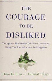
The Courage to Be Disliked: The Japanese Phenomenon That Shows You How to Change Your Life and Achieve Real Happiness
A philosopher and an angry young man argue over five nights about Adlerian psychology, trauma, approval, and the freedom to be disliked.
2,054-word summary · 9 min read
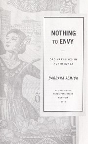
Nothing to Envy
Barbara Demick follows six defectors from Chongjin through the North Korean famine, showing how ordinary people lived, believed, and finally left.
2,068-word summary · 9 min read
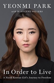
In Order to Live: A North Korean Girl's Journey to Freedom
A young North Korean girl crosses the Yalu, survives trafficking in China, and rebuilds her life in Seoul in this unsparing memoir.
2,027-word summary · 9 min read
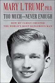
Too Much and Never Enough: How My Family Created the World's Most Dangerous Man
Mary L. Trump's 2020 memoir traces how a cold, zero-sum Queens household shaped her uncle, and uses family tax documents to challenge his self-made story.
2,059-word summary · 9 min read
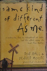
Same Kind of Different as Me
An art dealer and a formerly homeless sharecropper tell the story of the friendship that began at a Fort Worth mission and the woman who insisted on it.
2,023-word summary · 9 min read
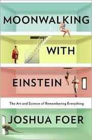
Moonwalking with Einstein: The Art and Science of Remembering Everything
A journalist spends a year training for the U.S. Memory Championship and discovers that extraordinary memory is mostly technique, attention, and a lot of…
2,027-word summary · 9 min read
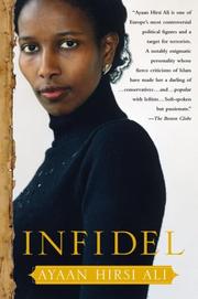
Infidel
Ayaan Hirsi Ali's memoir of a Somali childhood, a forced marriage, a Dutch asylum claim, and the political fight that followed the murder of Theo van Gogh.
2,041-word summary · 9 min read
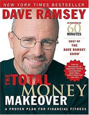
The Total Money Makeover: A Proven Plan for Financial Fitness
Dave Ramsey lays out seven Baby Steps, from a $1,000 starter fund to a paid-off house, with the debt snowball at the center.
2,663-word summary · 12 min read
Down and Out in Paris and London
Orwell's account of washing dishes in Paris hotels and tramping through London does not ask for pity, only for a clear look at how poverty actually works.
2,282-word summary · 10 min read
Year of Yes: How to Dance It Out, Stand in the Sun and Be Your Own Person
Shonda Rhimes takes her sister’s accusation seriously and spends a year saying yes to the things that frighten her, from live television to her own reflection.
2,585-word summary · 11 min read
The Girl with Seven Names: A North Korean Defector's Story
Hyeonseo Lee crossed the frozen Yalu River at seventeen, spent years hidden in China, escaped to South Korea, and later returned to rescue her family.
2,404-word summary · 11 min read
Love Does
A lawyer and activist tells stories of saying yes, showing up, and loving people through ordinary, often ridiculous actions.
2,411-word summary · 11 min read
Don't Sweat the Small Stuff ... and It's All Small Stuff: Simple Ways to Keep the Little Things from Taking Over Your Life
Richard Carlson’s 1997 bestseller offers one hundred short chapters on lowering the volume on daily irritations, and it is more pragmatic than its title…
2,502-word summary · 11 min read
The Wright Brothers
David McCullough tells the story of two self-taught Ohio brothers, working largely alone and out of a bicycle shop, who solved the problem of flight before…
2,027-word summary · 9 min read
Made to Stick: Why Some Ideas Survive and Others Die
The Heath brothers break down why some ideas vanish on contact while others lodge in memory, tracing six traits that make a message stick.
2,527-word summary · 11 min read