
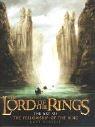
The Art of The Fellowship of the Ring
2,347-word summary 10 min read 192 pages in the book
- First published
- 2002
- Publisher
- HarperCollins
- Pages
- 192
- ISBN
- 9780007135639
Reading options
What's inside (9 sections)
I found this one in a used bookstore on a rainy Saturday. I was not even looking for it. I had just rewatched Peter Jackson's Fellowship with a friend who kept pausing to ask how they made the Shire look so lived in. When I saw the spine on the shelf, thick and glossy and full of Orc faces, I grabbed it. This is The Art of The Fellowship of the Ring by Gary Russell, published in 2002 by HarperCollins, 192 pages in the edition I have. It is a companion to the first Jackson film, not to Tolkien's novel on its own. I spent a week flipping through it at the kitchen table.
My first surprise was how practical it feels. I expected pretty pictures with captions. There are plenty of pretty pictures. But the through line is process. You see a pencil sketch turn into a painted study. Then that study turns into a small clay model. Then that model turns into a full set or a foam latex face you can actually light for camera. Russell keeps the text short and lets the crew explain in plain terms what they were trying to solve. I liked that. It reads like a shop visit.
If you have not seen the film, some of this will feel distant. The book walks the story in film order. It starts in the Shire and ends around Isengard and the breaking of the Fellowship. That choice helps if you know Frodo and Sam and Aragorn already. You can match each design to a scene you remember. If you only know the books, you will still follow it, but you will keep noticing places where Jackson simplified or reshaped things for screen.
Hobbiton and the Shire come first
The opening section stays in Hobbiton longer than I expected, and I mean that as praise. The team built a real Hobbiton in New Zealand, on a farm with rolling grass and a lake nearby. They planted gardens a year ahead so hedges and beans and flowers would look settled. They built fences and sheds and a mill that never needed to work. The book shows early drawings of Bag End with round doors and crooked chimneys. Then it shows photos of the finished lane with smoke coming out and laundry on lines.
What stuck with me was the attention to scale. Hobbits are small, but the actors playing them are not that small. So the crew used a few tricks at once. Some sets were built larger than normal so Ian McKellen as Gandalf would look huge inside Bag End. Some sets were built in two sizes. Some shots used stand ins of different heights. Russell explains this without getting too technical. He points to a door frame or a chair and tells you why it was made that way. I started noticing those choices when I rewatched the birthday party scene.
The Shire also sets the color rules for the whole film. Greens and warm browns. Soft cloth. Wood that looks hand cut. The book shows fabric samples and paint tests next to finished shots. You can see how they wanted Hobbiton to feel safe and a little out of time. When the Black Riders show up later, that safety makes their black shapes read even colder. I had never thought about it that way before picking up this book.
The Hobbits and the casting
The next part moves from place to people. There are pages on Frodo and Sam and Merry and Pippin, with head casts and ear tests and hair tests. Hobbit feet get a whole spread, which made me laugh at first and then made sense. Those feet had to survive mud and long walking takes. They had to look like skin from a few feet away. The crew tried different sizes and hair patterns before they settled on pairs the actors could actually wear all day.
Casting photos sit next to character sketches here, and that pairing is one of the best things in the book. You see Elijah Wood with large blue eyes next to early Frodo drawings that lean younger and softer. You see Sean Astin as Sam with a rounder face and work clothes that mark him as a gardener. Merry and Pippin look a bit more mischievous in both sketch and photo, with looser hair and brighter vests. None of this feels like star coverage. It feels like fitting a person into a folk culture.
I also liked the small notes on how Hobbits move. Russell mentions walk tests and posture notes in passing. Hobbits do not march. They amble. They carry packs badly at first. That detail pays off in the early road scenes. When I think back to the film, the Hobbits look tired in a real way by Bree. Their cloaks get dirty. Their feet get scuffed. The book helps you see that this wear was planned from the start, with spare costumes aged to different levels.
Rivendell and the art of Alan Lee and John Howe
Then we get to Rivendell, and the tone shifts. This is where Alan Lee and John Howe take center stage. Both men had been drawing Middle earth for years before the films. The book gives them room, with page after page of pencil work and watercolor studies for Elven halls and bridges and falls. Lee tends toward soft light and thin lines. Howe tends toward stronger shapes and carved detail. Seeing them side by side explains why Rivendell feels both calm and old.
The process pages here are my favorite in the whole volume. A rough Lee sketch of a pavilion becomes a cleaner drawing with roof angles marked. Then a model maker builds a small white form to test how light falls through it. Then the full set goes up with carved wood and pale stone. Russell does not print long interviews. He prints short notes about what problem each step solved. Sight lines. Weather cover. Room for cameras to move. It is very grounded.
Elven design gets the same care. The book shows ear shapes and wig tests and circlet designs for Elrond and Arwen and the background Elves. The palette stays muted. Silver and grey and faded blue. The cloth looks light but not flimsy. Weapons for Elves are slim, with leaf shapes worked into hilts and bows. I had always thought Rivendell just looked pretty. After this section I saw it as a system. Everything points to age and care and quiet wealth, without gold piled everywhere.
Moria, the Dwarves and Lothlorien
Moria flips that system on its head. The book moves underground with the Fellowship, and the art turns heavy. Big columns. Square cut stone. Deep shadows. The Dwarf style is all weight and geometry. Doors are huge. Halls run long. The Balin tomb sequence gets sketches that show how the crew planned light from a single shaft above. You see the Bridge of Khazad dum as a thin line over black, first as a thumbnail sketch and then as a set photo that still scares me a little.
What I appreciated was the honesty about limits. Moria had to feel endless, but they only had so much stage. So they used forced perspective and painted backings and smoke to stretch a hall. The book shows a few of those tricks in plain photos. Once you see the edge of a set in daylight, you cannot unsee how clever the finished shot is. That did not spoil the film for me. It made Gandalf hanging over the gap feel more impressive, because I knew how little room they had to fake depth.
Lothlorien follows, and it could have felt like Rivendell again. It does not. The palette turns gold and green. The trees matter more than the stone. The book shows studies of mallorn trees and rope bridges and tall platforms that sway a little in wind. Galadriel and Celeborn get costume pages with layered veils and bark tones. The mirror of Galadriel is shown as a simple basin in a dark room, which surprised me. On screen it glows. In the book you learn how much of that glow is lighting and water and camera angle. Simple means can make a strange effect when the design is clear.
Isengard, Orcs and Uruk-hai
Saruman's home brings a colder kind of design. Isengard starts white and ordered. Then the pits open. The book traces that change with drawings of Orthanc as a black spike and the grounds around it turning to mud and fire and wheels. Christopher Lee barely needs makeup to look stern, and the book knows it. Most pages here go to his rooms and to the machines below. Gears. Chains. Burning vents. It is industry eating a garden.
Orcs and Uruk-hai get a lot of space, and this is where the shop talk shines. Faces start as sketches with jaw shapes and brow ridges marked. Then sculptors make heads in clay. Then molds come off those sculpts for foam pieces actors wear for hours. The book shows teeth and contact lenses and hand claws laid out like tools. Some designs lean toward ape shapes. Some lean toward rotted skin. The Uruk-hai look bred for war, taller and straighter, with dark armor that fits close.
I winced a few times, in a good way. There are close photos of prosthetics with paint still wet. Russell keeps the tone matter of fact. He notes how long application took and how stunt performers needed versions they could fight in. If you like monsters, this section alone is worth the price of a used copy. If you do not like gore, you can skim the teeth pages and still get the point. The film needed enemies that looked painful to be near, and the crew built them piece by piece.
Weta Workshop, costumes and weapons
By the middle of the book I stopped thinking of Weta as one shop and started thinking of it as a small town. Richard Taylor leads the effort, and his team covers creatures and armor and miniatures and props at once. The book moves through departments without getting lost. One spread shows a sword hilt drawn in pencil. The next shows that hilt carved in wood. The next shows it cast in metal and then worn dull for camera. That chain of sketch to model to screen repeats so often that you start to predict it, and that rhythm is satisfying.
Costumes get their own careful treatment. Ngila Dickson and her crew had to dress Hobbits and Men and Elves and Orcs with different cloth and cut so you could read culture at a glance. The book shows dye tests and embroidery samples next to finished robes. Aragorn's gear looks patched and oiled. Boromir's has Gondor worked into belt and bracer. The Hobbits start clean and end frayed. Elven robes hang smooth. I loved the pages on aging, where new coats are scuffed and washed and dragged so they do not look fresh from a shop.
Weapons follow the same logic. Swords for Men are broad and plain. Elven blades are thin with etched lines. Orc blades look hacked out and cruel. Sting gets a hero treatment, small and bright beside larger props. Bows and quivers and shields fill gaps between portraits. None of these pages feel like filler. Each one ties back to story. A ranger who lives outdoors would not carry polished steel. A guard of Gondor would show his city. The book makes those links without lecturing.
Bigatures, locations and what the book leaves out
The last stretch covers scale tricks and real places, and it ties the whole thing together. The crew built large miniatures for places like Orthanc and Rivendell and the Argonath. The team called them bigatures because some stood several feet tall. The book shows painters adding tiny moss and cracks with brushes the size of toothpicks. On screen those models read as vast stone. In photos you can see hands holding a tower. That contrast delighted me every time.
Locations across New Zealand do just as much work. Hills near Matamata became the Shire. Rivers and marshes stood in for the road south. Snowy peaks framed the pass over Caradhras. The book pairs location photos with film stills so you can see what the camera kept and what sets added. Skies get special mention, because light there changes fast. I came away wanting to visit, but also glad they left Hobbiton standing for fans. It feels right that part of the film stayed in the ground.
Now for fair criticism, because this book is not perfect. First, the text is light. Russell writes clear captions and short intros, but if you want long essays on Tolkien or on Jackson's choices, you will not find them here. Pictures lead. Words follow. Second, the price for a new copy back then felt steep for 192 pages, and even now a clean hardcover can cost more than a normal film guide. I bought used and felt fine about it. At full price I would have paused. Third, the view is film only. Book readers who want Tom Bombadil or blue wizards or deeper lore will not get that here. This is about what could be built and shot.
Still, I keep pulling it off the shelf. It taught me to watch Fellowship differently. I notice door sizes in Bag End. I notice how Elven cloth moves. I notice when a hall is paint and smoke and when it is stone. For a film fan that is a gift. For an art student it is a clean record of one way to move from sketch to screen, with names attached to each job. If you love the first film and you like seeing how things get made, make room for it. Just know what it is. A shop album with heart, not a deep history.
FAQ
Is this book about Tolkien's novel or Peter Jackson's film?
It covers Peter Jackson's The Fellowship of the Ring film, published in 2002 by HarperCollins. It follows the film in story order and does not cover Tolkien's novel on its own.
Which artists and makers does the book cover?
Alan Lee and John Howe supply much of the concept art, Weta Workshop under Richard Taylor builds creatures and armor, and Ngila Dickson leads costumes. Weapons teams, miniature crews and New Zealand location scouts fill out the rest.
Do I need to see the film before reading this art book?
You can still enjoy the pictures without it, but the book assumes you know Frodo, Aragorn and the quest. Seeing the film first makes the design choices for the Shire, Moria and Lothlorien much clearer.
Similar books
New Moon: The Complete Illustrated Movie Companion
Behind the scenes guide to the New Moon film: Weitz, the wolves, and the Volterra shoot, with cast interviews.
2,602-word summary · 12 min read
Gathering Blue
Orphaned weaver Kira is kept in the Council Edifice to mend the Singer robe, learning dyes and control until lasting blue thread opens choice.
2,954-word summary · 13 min read
Twilight: The Complete Illustrated Movie Companion
Behind the scenes guide to the first Twilight film with cast photos, sets, and effects stories.
2,526-word summary · 11 min read
The Invisible Life of Addie LaRue
Addie trades her soul for freedom in 1714 France and lives forgotten for 300 years, until a Brooklyn bookseller remembers her name.
3,480-word summary · 15 min read
The Thief
A boastful young thief is pulled from a prison to steal a legendary stone for the king's magus, and the story he tells about himself is not the whole story.
2,514-word summary · 11 min read
The Tale of the Body Thief
Lestat trades bodies with a psychic thief for one day of mortality and ends up trapped, sick, and hunting his own vampire body.
2,069-word summary · 9 min read
The Blinding Knife
Kip trains to join the Blackguard while the Prism hides his true identity, loses his colors, and fights a war against a rogue drafter who wants to birth a god.
2,049-word summary · 9 min read
The Art Forger
A disgraced Boston painter agrees to copy a Degas stolen from the Gardner Museum, then begins to suspect the original she is copying is itself a forgery.
2,117-word summary · 9 min read
Six Scorched Roses
A dying scholar bargains with a reclusive vampire for blood, and six roses turn a transaction into a slow, dangerous romance.
2,663-word summary · 12 min read
Ship of Magic
A sentient ship wakes when her captain dies, and the family that owns her starts to come apart over who gets to sail her.
2,026-word summary · 9 min read
Inkdeath
The final Inkworld novel sends Mo into the land of the dead, leaves Meggie choosing between two boys, and ends the Adderhead's immortality with three written…
2,062-word summary · 9 min read
Hounded
A two-thousand-year-old druid runs a bookshop in Arizona, hides from an Irish god who wants his sword back, and talks to his dog.
2,159-word summary · 10 min read
Dawnshard
Rysn sails toward forbidden Akinah to save her dying larkin and finds a Dawnshard guarded by the Sleepless.
3,229-word summary · 14 min read
Bone, Vol. 1: Out from Boneville
Three cartoon cousins are run out of Boneville, separated by locusts, and dropped into a valley where rat creatures and an old grudge are waiting.
2,155-word summary · 10 min read
Vow of Thieves
Kazi and Jase return to Tor's Watch to find it occupied, and their marriage is tested by captivity, betrayal, and a war for the town of Hell's Mouth.
2,059-word summary · 9 min read
The Lost Sisters
Taryn Duarte writes a letter to her twin, Jude, explaining how she fell for Locke and why she stayed silent while he used them both.
1,914-word summary · 9 min read
The Icebound Land
Captured and enslaved in Skandia, Will fights a drug that erases him while Halt and Horace cut a bloody road through Gallica to bring him home.
2,088-word summary · 9 min read
The Hunger Games Tribute Guide
The official 2012 companion to the first Hunger Games film profiles all twenty-four tributes and walks through the reaping, training, and interviews.
2,092-word summary · 9 min read
The Field Guide
Three siblings move into a creepy Maine estate, anger a brownie, and find a forbidden guide to the fairy world in the first Spiderwick book.
2,033-word summary · 9 min read
Magic Burns
A magic flare hits Atlanta, and mercenary Kate Daniels must recover stolen maps, find a missing witch, and keep a teenage girl alive while Celtic gods try to…
2,021-word summary · 9 min read
At Grave's End
Cat and Bones face Max, a zombie-raising ancient vampire, and a prophecy that ties their marriage to Patra's death in the third Night Huntress novel.
2,061-word summary · 9 min read
Year One
A plague released in Scotland kills most of humanity, and the survivors discover magic, build a town, and wait for a child who may save them.
2,029-word summary · 9 min read
The Secret of the Nagas
Shiva hunts the Naga who attacked Sati, discovers her hidden twin sister and lost son, and follows the trail to the Naga capital of Panchavati.
2,442-word summary · 11 min read
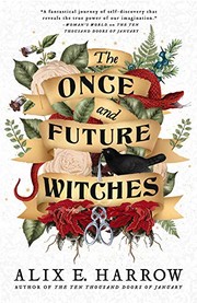
The Once and Future Witches
Three estranged sisters bring witchcraft back to an 1893 city where magic hides in nursery rhymes and the fight for the vote is also a fight for power.
2,132-word summary · 9 min read
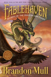
Secrets of the Dragon Sanctuary
Kendra is replaced by a plant copy and held by the Society, while Seth steals a unicorn horn so the family can enter a dragon sanctuary.
2,590-word summary · 12 min read
Lioness Rampant
Alanna searches for the Dominion Jewel with the Shang Dragon, then returns to Tortall to face Duke Roger at Jonathan's coronation.
2,478-word summary · 11 min read
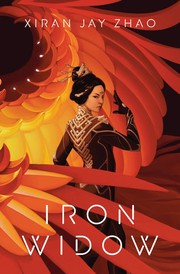
Iron Widow
Wu Zetian enlists to avenge her sister, kills her pilot, and becomes an Iron Widow in a mecha Huaxia where the machines are built to kill women.
2,444-word summary · 11 min read
Blood Bonds
Oleander is chained in a Resistance camp, and her five Bonds have to find her before Silas Davies finishes what he started in this third Bonds that Tie book.
2,018-word summary · 9 min read
Archenemies
Nova steals for the Anarchists while Adrian hides his Sentinel identity, and a serum that erases prodigy powers puts them both at risk.
2,485-word summary · 11 min read
Witches Abroad
Three Lancre witches fly to Genua to stop a fairy godmother from forcing a servant girl into a storybook marriage, and find a city arranged around a happy…
2,651-word summary · 12 min read